This is an edition of the newsletter Pulling Weeds With Chris Black, in which the columnist weighs in on hot topics in culture. Sign up here to get it in your inbox every Thursday.
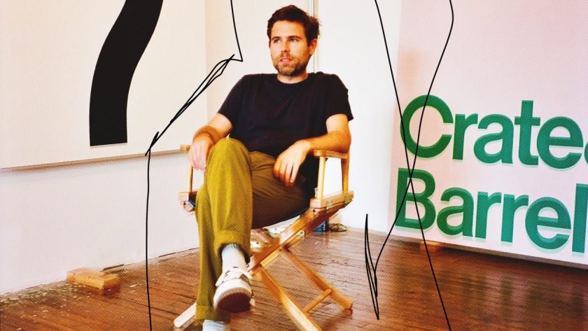
I don’t remember exactly when I first came across the work of Mathew Cerletty, but I was instantly struck by the combination of precision, vivid color, and sense of humor that his paintings possess. He takes everyday, almost banal subjects and presents them with such hyperreal precision that you cannot look away. Whether it’s his Edward Ruscha–inspired rendering of the Crate & Barrel logo or masterful reproductions of a Kohler sink or a manilla envelope, whatever subject he chooses makes you reconsider what is often overlooked and discover value where you might not have seen any before.
Cerletty, who says he produces around 15 canvases a year, does his own thing, at his own pace, which—combined with the familiar subject matter—makes his work feel timeless. He’s not an art world superstar, but after painting professionally for 20 years, he shows at cool galleries and has earned a small but dedicated base of collectors. I saw my friend Naomi Fry interview him last year at the beautiful new gallery Karma on Santa Monica Boulevard, at an event to celebrate his show, True Believer, which blew me away. I was struck in particular by his painting of a Triscuit box—the yellow one, with the blue and red logo. Triscuits were a staple in my household growing up. My dad ate them with cheese slices almost every day. Ever since that show, I have wanted to talk to Cerletty about his process and choice of subject matter, some of which seems obvious (an orange Nike Swoosh logo), and some painstakingly considered (the Barbie-pink text from the Pretty Woman VHS box, isolated on a canvas).
I made the trek to Cerletty’s Williamsburg, Brooklyn, workspace in some truly oppressive heat. Cerletty—who is from Wisconsin, the birthplace of Kohler—has a warm but formal manner, and the cleanest studio I have ever set foot in. His next show, Mineral Spirits, goes up in September at Standard (Oslo), so most of the works are nearly finished. We had a nice chat about I Think You Should Leave and the marketability of a painting of a “Keep Right” sign.
The cleanliness of your studio matches the art.
I did clean up a little bit. I’m having guests over. I’m a Midwesterner. But paint is disgusting, and I have to deal with it every day. It gets everywhere.
Do you come here every day?
Not anymore, being a parent, but I would love to. (Cerletty has a three-year-old.) I don’t really come in on the weekends, and I’m on a pretty strict 11-to-six, five-days-a-week (schedule), but I used to be here 16 hours a day, and I’d still come in on the weekends. But I’ve been civilized by family.
Do you feel like you’re getting everything done?
I do. The gallery’s slow, and I don’t fit into the most convenient model for being a successful artist, which would be several shows per year in different locations, art fairs, and all this stuff. I make, like, 15 things a year. Fifty would be a lot easier for becoming a prominent artist. So I have to be picky about what I use this stuff for. It needs to make an impact. But I’ve been doing it for 20 years, and it’s wonderful. I’m going for that low-output, high-quality thing, and it’s good. It’s been nice.
I saw you in LA at Karma, and your process for that show was a lot more painstaking than I thought. How does it start, and how does it finish?
Well, when there’s a project, like a show, it’s anything goes—whatever seems like a good idea for a painting. With that show, the first one I had was the big pile of cardboard boxes that became the centerpiece. And the intimidation of that huge space, which was much bigger than anything I’d done before, made me feel like, I need a lot of big stuff to make it look good.
People assume that artists are in their heads, overanalyzing it. But you were just like, “Bro, this place is big. I’ve got to fill this shit up!”
Yeah, it can be very practical! I had done a lot of graphic work before, and I thought, Maybe I could bring some of those back, because they’re a little faster and can be big and fun. I thought the contrast of the more rendered, realistic images would pop even more if they were next to something flat and graphic. That’s how that show came about, and I just kept mixing things.
It sounds like the way people make records. Sequencing is critical.
It’s like, Oh, I need a ballad now.
So do you draw first?
Not necessarily. There aren’t really rules about it. Sometimes an image seems like it would be good as a painting and a drawing, and sometimes it seems like it would be good as one but not the other.
The colors are always vibrant. That has to do with materials, but is that something you’re drawn to personally?
Totally. I love these colors, and finding opportunities to use as many bright colors as possible has been a motivator over the last couple of years. Before, it was always like, “The subject is this,” “It’s this color.” I’m not going to change it because it would put a spin on the image that would start making you think about me making choices, which I don’t want to be the subject. I want you to come to it as if it’s not about me, like it’s just something that already existed.